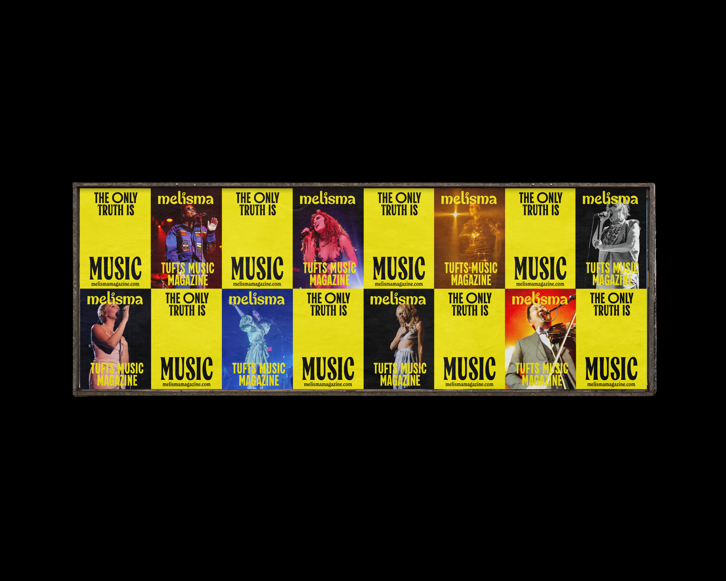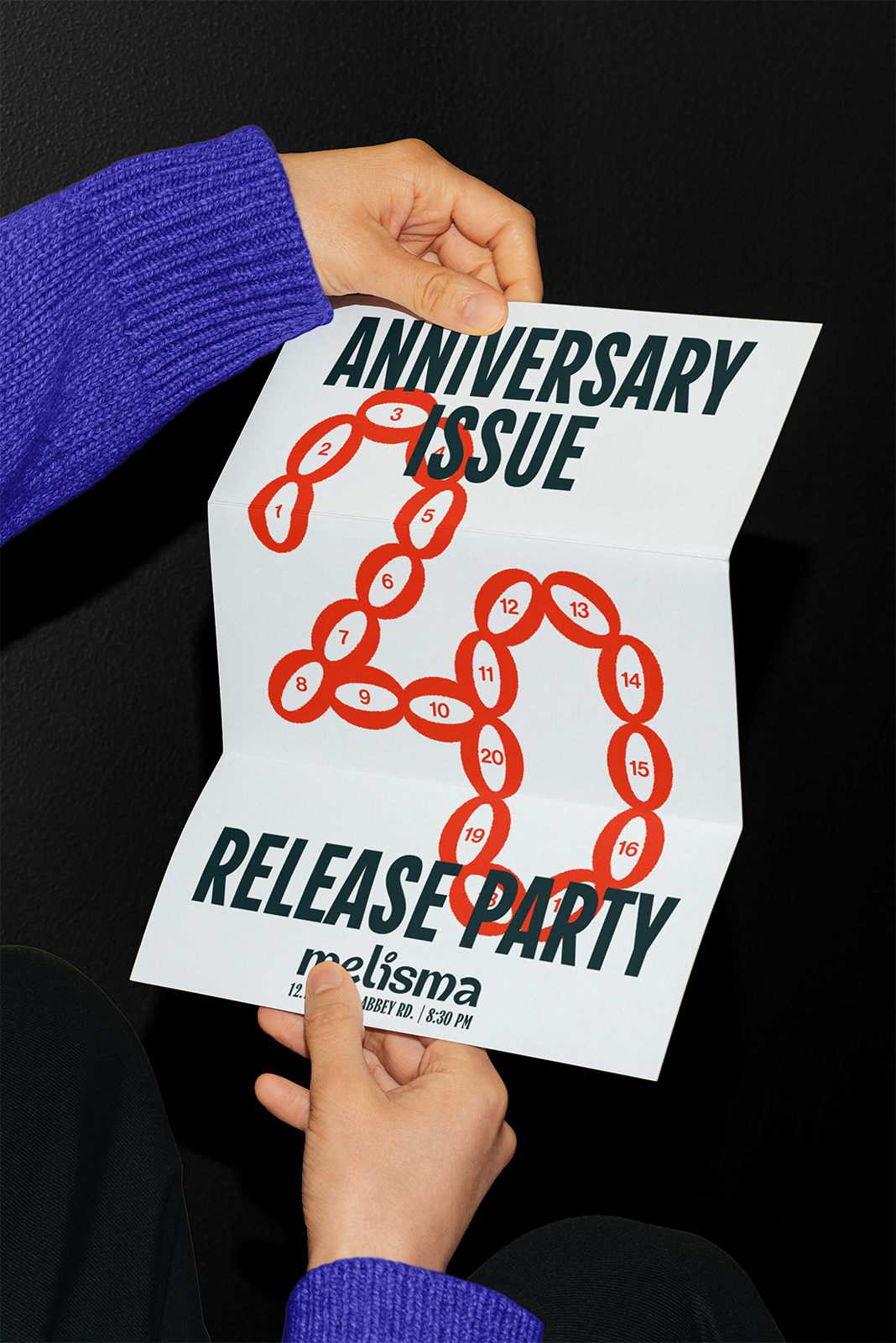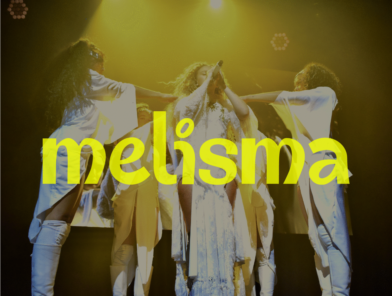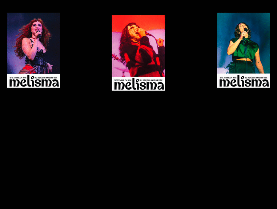
Custom drawn wordmark and full brand redesign for Melisma, Tufts University’s premier journal of music, during my tenure as Creative Director.
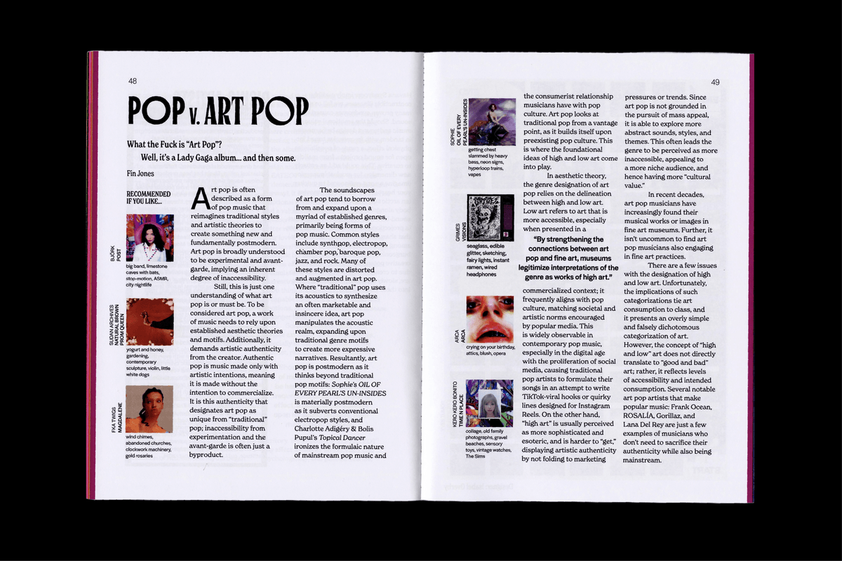
This rebrand sought to align Melisma Magazine’s visual presence with the definition of melisma itself, a group of notes sung to one syllable of text. Each character in the wordmark, custom drawn in Glyphs, is inspired by the geometry of a music note. The variable font ‘Salo’ was chosen as the publication’s primary display typeface for marketing and article titles based on inspiration from 80s jazz posters. Each printed publication issue features roughly fourteen pieces of research-grounded journalism on the music industry and music production in addition to submissions of art and design.
Completed with guidance from David Jonathan Ross and Christopher Caldwell.